This is the work Nathan went to school for and the field that lead him to his find his passion for film. Though he has been focusing primarily on film work he has still had the opportunity to flex his creative muscles in these areas to keep them fresh. Here is a list of his web and design proficiencies.


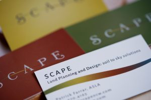
This was a logo design and business card project for a land planning and design company. We wanted to highlight the company’s focus on balancing their design work with nature; working with the natural scape and processes of the land and surrounding plant life and creatures rather than against it. So we designed a minimal and balanced logo that captures the structure and purpose of design but incorporates strong organic flourishes. We used colors that evoke the 4 elements: earth, fire, wind, and water and if you look close you’ll see hints at the ancient symbol for air.


North 40 Productions needed a clean professional logo to represent their company as well as some variations that captured their “Northwest” adventure seeking and playful spirits. This logo and the following yeti version fit the bill. Visit North 40’s website.


A film logo for a documentary project by North 40 Productions that explores how we grow our food and what makes a truly sustainable farm. Natural color with textures, and a more literal design style felt most appropriate for this hand-made grassroots film.

Redefine Positive is a grassroots, community-funded organization founded to develop free educational videos that support HIV/AIDS education curriculum for students in elementary, middle, and high school. This logo features a hand drawn style to match its grassroots beginnings while keeping a professional and clean mood with bright colors and subtle gradients.

Screenshot from the film. Share the warmth is a yearly fundraiser to help families who cant afford their electric bills. While working with North 40 Productions on the video for this campaign, Nathan also created a couple different versions of this logo for Grant County PUD and though they didn’t choose this version, it was his personal favorite. Inviting, warm and festive. View the film.

Screenshot from film. View the film and the logo animation Nathan created here.


This is an early version of Northern Flicker’s logo. Hopefully by now you know what we are about and can agree that this, although a pleasant design, wasn’t quite the fit for us.
