Logo Evolution

By Ada Ketchie

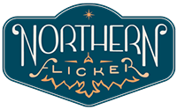
We always knew that we wanted the Northern Flicker to represent the work we are setting out to do. If you read our previous post “What’s in a name?” you learned just how layered the symbolism and significance is for us.

But the final name and logo you see on our newly minted website is far from where we started. And though it took longer than we wanted, in what was a very tight timeframe, we are very happy with the evolution undertaken and the outcome we’ve produced. 

We hope you find it interesting to track our progression. It certainly took patience and perseverance! 

Prior to the idea of this adventure, we had been mulling over potential band names (we’re a fledgling duo, just breaking into our local scene). Nathan started digging on the name Flicker Feathers. Fun alliteration and most importantly a special shared symbol that’s come to hold significance in our lives. See here Nathan’s first Christmas gift to me, a hand painted water-color and a beautiful poem he wrote to honor the connection I feel between these feathers and my late father. 

Flicker-Feather2.jpg

We never quite committed to that name, but once we decided to embark on this journey we revisited the idea, adapting it to Flicker Flight Creative. We felt it was more aspirational and suitable to evoking the suite of creative services we were hoping to offer. This was the first incarnation of logo #1. Clean, sleek, and maybe a bit retro. 

But in our eyes it kind of said motorcycle club or 50’s ice-cream shop a bit more than we wanted, so we decided to keep playing. Nathan, our lead creative and chief logo-designer, kept doodling away.

The next iteration was meant to evoke more of our Northwestern roots and to tie in more imagery of the bird. Notice here the wings and body of the bird are made from “F’s”. In this round we were weighing up the subtle differences between these two options.

As great as all of those options were, something still didn’t sit right. We even started to question our name (which was a bit disheartening after all the effort we had put into our existing logos). Something about it just felt a bit forced. Too tongue-twistery. Still, such is the creative process and we agreed to keep experimenting. Flicker was recommended, but I think we all know a certain company that dominates the use of that word 

As great as all of those options were, something still didn’t sit right. We even started to question our name (which was a bit disheartening after all the effort we had put into our existing logos). Something about it just felt a bit forced. Too tongue-twistery. Still, such is the creative process and we agreed to keep experimenting. Flicker was recommended, but I think we all know a certain company that dominates the use of that word 

So we thought of other combinations we liked. Fly & Flicker being Nathan’s pick. Fox & Flicker being Ada’s. In the end though, during a moment of creative fatigue, up floated the most obvious idea of all. The name of the bird itself.  Northern Flicker. It had a solid ring to it. Evoked lots of imagery that we liked. Connoted where we were from. So we ran with that. More doodles and design ensued. 

Finally we were getting closer. We drew a lot of inspiration from 20’s art deco. We used color samples from the Northern flicker and the night sky. Nathan worked in the look of wings for the F and R of Flicker – harkening back to earlier ideas and iterations. And with a bit of feedback from colleagues we decided to offset the color of the word flicker – just in case anyone might miss it. 

Long story short – it takes a long time to make a good logo. You have to leave ideas you love behind. You end up “wasting time” on ideas that go nowhere.  You have to be willing to start over if it doesn’t quite feel right and agree to just finish it even if there are countless options left unexplored. So here you have it, our final product. A hand drawn expression of who we are. The logo for this fledgling project. We give you, Northern Flicker. 

MORE POSTS